Nicht jede Innovation ist positiv!
Was eben noch als Fehler auf der Webseite durchging ist jetzt traurige Gewissheit – die WIPO schickt ihr Logo in den Ruhestand und präsentiert am World Intellectual Property Day eine vollständig neue Version.
Das neue Logo:
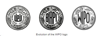
Die bisherige Logoevolution:
Quelle: Pressemitteilung der World Intellectual Property Organization
Ich meine, die WIPO gönnt sich hier einen perfekten Fehlschuss!